UI 节点参考
本页描述 @dsh-blue/blue-ui 当前 Public Beta 的完整 wire-node 构造接口。 ui.* builder 只负责构造、复制并冻结 renderer-neutral 数据;Blue renderer 负责 校验、布局、主题、宽度、焦点、输入路由和事件派发。插件仍然拥有业务数据、 受控状态以及事件成功后的语义。
节点树如何组织、受控状态如何流转,见配套指南组件模型。
import type { BlueUiEvent, BlueUiEventContext } from '@dsh-blue/blue-api'
import { ui } from '@dsh-blue/blue-ui'
职责边界
| Blue 负责 | 插件负责 |
|---|---|
| 绘制 text、tabs、list、form、actions 等节点 | 提供节点数据和业务文案 |
| 当前 renderer 的主题、宽度降级、焦点和导航 | 保存 activeId、selectedIds、field value 等受控状态 |
把用户操作转换成 BlueUiEvent | 校验事件并调用所属 domain service/action |
| 成功事件后的重渲染、abort、stale 和 unload fence | 外部数据变化后调用 pane/overlay handle 的 refresh() |
节点不接受 renderer callback、raw key、终端坐标、ANSI 或 focus handle。不要在 render() 中做 I/O,也不要把 Agent、Session 或 mutable renderer object 放进节点。
公共规则与限额
- 一棵树最多 256 个节点,根节点深度为 0、最大深度为 8;任一数组最多 200 项; 全树字符串合计最多 20,000 个 UTF-16 code unit。
- builder 会递归复制并冻结输入,循环对象会被拒绝。Host admission 只接受普通 object 和 dense array,并移除 ANSI、C1 与不安全控制字符。
- 所有数值布局字段都是非负 safe integer。
minSize不能大于maxSize,viewport 的最小值不能大于对应最大值。 - tabs/list/form 的 control id、form field id、action item id,以及 form/loader 的 submit/cancel id 在同一棵交互树中不能产生冲突。Tab/list item id 至少在所属 节点内唯一;作为 control 的 id 不能为空。
tone是语义颜色,不是色号:default | muted | accent | success | warning | danger。emphasis是normal | strong;省略时按普通文本处理。
下面的“默认”描述 0.1.2-alpha.1 当前 Blue TUI。wire contract 只承诺字段语义, 不会承诺具体边框字符、颜色值或按键绑定。
内容节点
text

危险 tone 的单行提示(宽度 48)。
ui.text(content: string, options?: { tone?: BlueTone })一段可换行的语义文本,用于状态提示、结果摘要等说明性内容;tone 省略时使用 主题正文色。上面的截图渲染的就是这个节点:
ui.text('Connection lost', { tone: 'danger' })六种 tone 的完整对照:
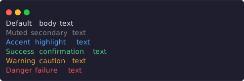
default、muted、accent、success、warning、danger(宽度 56)。
ui.stack.column([
  ui.text('Default body text'),
  ui.text('Muted secondary text', { tone: 'muted' }),
  ui.text('Accent highlight text', { tone: 'accent' }),
  ui.text('Success confirmation text', { tone: 'success' }),
  ui.text('Warning caution text', { tone: 'warning' }),
  ui.text('Danger failure text', { tone: 'danger' }),
])
长文本在分配宽度处换行,不会被截断:
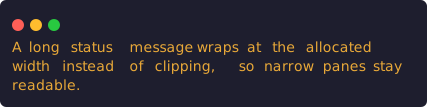
同一条 warning 文本在宽度 48 下占三行。
ui.text('A long status message wraps at the allocated width instead of clipping, so narrow panes stay readable.', { tone: 'warning' })richText

muted 前缀接 strong accent 模型名(宽度 64)。
ui.richText(spans: readonly BlueInlineSpan[])

type BlueInlineSpan = {
  text: string
  tone?: BlueTone
  emphasis?: 'normal' | 'strong'
}
在同一段文本中组合 tone 与强调,适合“标签 + 高亮值”这类行内混排。renderer 负责换行,插件不要拼 ANSI。上面的截图渲染的就是这个节点:
ui.richText([
  { text: 'Model ', tone: 'muted' },
  { text: 'deepseek-chat', tone: 'accent', emphasis: 'strong' },
])
tone 与 emphasis 可以自由组合成更长的混排段落:

muted 叙述、strong accent 路径、strong 数值与 danger 结尾(宽度 56)。
ui.richText([
  { text: 'Rebuild of ', tone: 'muted' },
  { text: 'packages/core', tone: 'accent', emphasis: 'strong' },
  { text: ' failed after ', tone: 'muted' },
  { text: '42s', emphasis: 'strong' },
  { text: ' with 2 errors', tone: 'danger' },
])
fields

两行 label/value,状态值带 success tone(宽度 64)。
ui.fields(rows: readonly {
  label: string
  value: readonly BlueInlineSpan[]
}[])
用于紧凑的 label/value 信息,例如会话元数据或环境摘要。value 始终是 span 数组,不是任意 BlueUiNode。上面的截图渲染的就是这个节点:
ui.fields([
  { label: 'Status', value: [{ text: 'Ready', tone: 'success' }] },
  { label: 'Model', value: [{ text: 'deepseek-chat' }] },
])
多行 fields 中,每个 value 可以由多个 span 拼出强调层次:
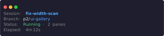
四行 fields:strong accent 会话名、拼色 branch、组合状态与 muted 时间(宽度 64)。
ui.fields([
  { label: 'Session', value: [{ text: 'fix-width-scan', tone: 'accent', emphasis: 'strong' }] },
  { label: 'Branch', value: [{ text: 'p2/' }, { text: 'ui-gallery', tone: 'accent' }] },
  { label: 'Status', value: [{ text: 'Running', tone: 'success' }, { text: ' · 2 panes', tone: 'muted' }] },
  { label: 'Elapsed', value: [{ text: '4m 12s', tone: 'muted' }] },
])
code
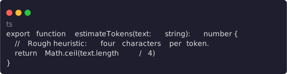
带 ts 语言提示的多行代码块(宽度 64)。
ui.code(value: string, options?: { language?: string })表达代码或预格式化文本,例如补丁片段、命令输出或配置内容。language 是 renderer hint,不保证语法高亮。上面的截图渲染的就是这个节点:
ui.code([
  'export function estimateTokens(text: string): number {',
  '  // Rough heuristic: four characters per token.',
  '  return Math.ceil(text.length / 4)',
  '}',
].join('\n'), { language: 'ts' })
diff
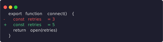
多行 before/after:上下文行原样保留,改动行以 -/+ 标出(宽度 64)。
ui.diff(before: string, after: string)表达同一内容修改前后的语义对比,例如待确认的编辑。插件提供原始文本,不手工 添加 diff 颜色。上面的截图渲染的就是这个节点:
ui.diff(
  ['export function connect() {', '  const retries = 3', '  return open(retries)', '}'].join('\n'),
  ['export function connect() {', '  const retries = 5', '  return open(retries)', '}'].join('\n'),
)
sections

一个展开的 section 与一个 collapsed section 并排(宽度 64)。
ui.sections(sections: readonly {
  title?: string
  body: BlueView
  collapsed?: boolean
}[])
每个 body 只能是轻量 BlueView:text | fields | code | diff | sections。 它不能直接包含 tabs、form、actions 或其他完整 BlueUiNode。 collapsed 省略时等同 false;设为 true 时当前 TUI 只显示 section 标题, 无标题则显示省略提示。它是静态展示状态,不会自动生成展开/折叠事件。上面的 截图渲染的就是这个节点:
ui.sections([
  {
    title: 'Environment',
    body: ui.fields([
      { label: 'Node', value: [{ text: 'v24.15.0' }] },
    ]),
  },
  {
    title: 'Raw transcript',
    body: ui.text('Hidden until expanded.'),
    collapsed: true,
  },
])
布局节点
child

宽度 64 满足 minWidth: 48,detail 正常显示。
ui.child(node: BlueUiNode, options?: {
  basis?: number | 'auto'
  grow?: number
  shrink?: number
  minSize?: number
  maxSize?: number
  when?: {
    minWidth?: number
    maxWidth?: number
    minHeight?: number
    maxHeight?: number
  }
})
普通节点可直接放入 stack;只有需要尺寸提示或响应式条件时才包装为 ui.child()。 尺寸是当前 stack 方向上的布局提示,不是固定终端行列承诺。when 使用该 surface 当前实际分配的 viewport;条件不满足时节点及其 controls 一起离树,Blue 会重新 协调焦点。child 只能作为 stack 成员出现,两张截图渲染的都是这个节点:
ui.stack.column([
  ui.text('Session overview'),
  ui.child(ui.text('Wide-only detail'), { grow: 1, when: { minWidth: 48 } }),
])
同一节点在宽度 40 下条件不再成立,detail 离树,只剩标题行:

宽度 40 不满足 minWidth: 48,Wide-only detail 离树。
stack.row / stack.column

column 中嵌套一个带 gap 的 row(宽度 64)。
ui.stack.row(children, options?)
ui.stack.column(children, options?)

type StackOptions = {
  gap?: 0 | 1 | 2
  align?: 'stretch' | 'start' | 'center' | 'end'
}
row 表达横向排列意图,column 表达纵向排列意图。省略 gap 时当前 TUI 使用 0;省略 align 时使用 stretch。renderer 可以在没有空间布局能力的 surface 上 安全降级,因此不要依赖某个子节点的绝对坐标。上面的截图渲染的就是这个节点:
ui.stack.column([
  ui.stack.row([ui.text('left'), ui.text('right')], { gap: 1 }),
  ui.text('below'),
])
配合 ui.child() 的 grow,row 按比例分配宽度:

grow: 1 与 grow: 2 把 row 宽按 1:2 分配(宽度 64)。
ui.stack.row([
  ui.child(ui.surface({ chrome: 'lane', child: ui.text('grow 1') }), { grow: 1 }),
  ui.child(ui.surface({ chrome: 'lane', child: ui.text('grow 2') }), { grow: 2 }),
], { gap: 1 })
surface
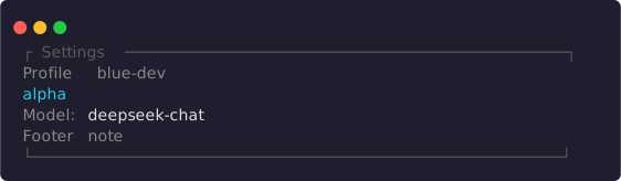
title、subtitle、badges、surface 边框、padding 与 footer 的完整组合(宽度 64)。
ui.surface({
  title?: string
  subtitle?: string
  badges?: readonly BlueInlineSpan[]
  chrome?: 'none' | 'lane' | 'surface' | 'overlay'
  padding?: 0 | 1 | 2
  child: BlueUiNode
  footer?: BlueUiNode
})
surface 把标题、徽标、正文和 footer 组合成一个语义容器。
| 字段 | 含义 |
|---|---|
title | 主标题 |
subtitle | 标题后的弱化说明行 |
badges | 使用 span tone/emphasis 的徽标行 |
chrome | 边框意图;默认 none |
padding | 内容侧留白级别;默认 0 |
child | 必填正文 |
footer | 可选尾部节点,位于正文与底边之间 |
chrome: 'overlay' 只是视觉意图,不会创建 overlay;真正的浮层仍通过 api.overlays.open() 打开。上面的截图渲染的就是这个节点:
ui.surface({
  title: 'Settings',
  subtitle: 'Profile blue-dev',
  badges: [{ text: 'alpha', tone: 'accent' }],
  chrome: 'surface',
  padding: 1,
  child: ui.fields([
    { label: 'Model', value: [{ text: 'deepseek-chat' }] },
  ]),
  footer: ui.text('Footer note', { tone: 'muted' }),
})
chrome: 'lane' 是更轻的变体:标题嵌在顶部规则线里,没有完整边框:

lane chrome:顶部规则线嵌入标题(宽度 64)。
ui.surface({
  title: 'Context',
  chrome: 'lane',
  child: ui.text('Lane chrome body'),
})
scroll
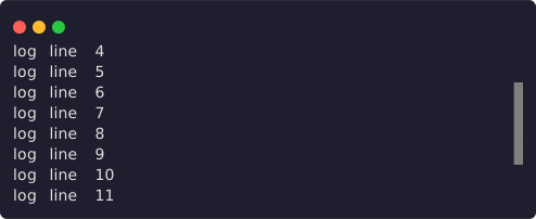
16 行内容放进 8 行 viewport、向下滚动 3 行后的呈现,scrollbar: true 的滚动条可见(宽度 56)。
ui.scroll(node: BlueUiNode, options?: {
  follow?: 'none' | 'start' | 'end'
  scrollbar?: boolean
})
follow 表达刷新后的跟随意图;省略时等同 none。当前 TUI 在 alternate-screen surface 中让 end 主动尾随底部,start 与 none 从顶部开始且不主动跟随;main screen 由外层滚动容器接管。scrollbar: true 请求可见滚动条。实际可滚高度来自 父布局,嵌套 scroll 会被拒绝。上面的截图渲染的就是这个节点:
ui.scroll(
  ui.stack.column(Array.from({ length: 16 }, (_, index) => ui.text(`log line ${index + 1}`))),
  { scrollbar: true },
)
受控交互节点
所有交互节点都由插件提供 canonical state,由 renderer 发出“建议的新状态”。 插件在 onEvent() 中接受该状态并成功返回后,Blue 自动重新调用 render(); 节点不会自行永久修改插件状态。
tabs

初始状态:activeId: 'summary',advanced 带 count 徽标,legacy 禁用(宽度 64)。
ui.tabs({
  id: string
  activeId: string
  items: readonly {
    id: string
    label: string
    disabled?: boolean
    count?: number
  }[]
})activeId必须对应一个 item;插件负责保存并更新它。disableditem 会显示但不能激活。count是非负 safe integer 计数提示,renderer 可在窄宽度隐藏它。- Tabs 只绘制 tab strip,不包含各 tab 的 body。
- 激活 item 时发出
{ kind: 'tab-change', controlId: id, tabId: item.id }。
let activeTab = 'summary'

const render = () => ui.stack.column([
  ui.tabs({
    id: 'settings-tabs',
    activeId: activeTab,
    items: [
      { id: 'summary', label: 'Summary' },
      { id: 'advanced', label: 'Advanced', count: 4 },
      { id: 'legacy', label: 'Legacy', disabled: true },
    ],
  }),
  activeTab === 'summary'
    ? ui.text('Summary content')
    : ui.text('Advanced content'),
])

const onEvent = (event: BlueUiEvent) => {
  if (event.kind === 'tab-change' && event.controlId === 'settings-tabs') {
    activeTab = event.tabId
  }
  return { ok: true, value: undefined } as const
}
插件接受 tab-change 并把 activeTab 写成 'advanced' 后,下一次 render() 输出如下——tab strip 的高亮与 body 都由 canonical state 决定:

activeId: 'advanced':count 徽标随高亮项显示,body 同步切换(宽度 64)。
ui.stack.column([
  ui.tabs({
    id: 'settings-tabs',
    activeId: 'advanced',
    items: [
      { id: 'summary', label: 'Summary' },
      { id: 'advanced', label: 'Advanced', count: 4 },
      { id: 'legacy', label: 'Legacy', disabled: true },
    ],
  }),
  ui.text('Advanced content'),
])
list

single 模式下选中第一项(宽度 64)。
ui.list({
  id: string
  mode?: 'single' | 'multiple'
  selectedIds: readonly string[]
  items: readonly BlueListItem[]
  filter?: string
  empty?: BlueUiNode
})

type BlueListItem = {
  id: string
  label: string
  detail?: string
  detailSpans?: readonly BlueInlineSpan[]
  badge?: string
  group?: string
  disabled?: boolean
}
mode 默认为 single。single mode 最多有一个 selectedIds;所有 selected id 必须存在于 items。detailSpans 存在时优先于 detail。group 只表达分组标题, badge 是紧凑标签;窄宽度下 renderer 可隐藏 detail。上面的截图渲染的就是这个 节点:
ui.list({
  id: 'item-list',
  selectedIds: ['one'],
  items: [
    { id: 'one', label: 'First item' },
    { id: 'two', label: 'Second item' },
  ],
})
filter 只展示当前查询,不会替插件过滤 items;插件必须把过滤后的 items 传入。 items 为空时渲染 empty,省略 empty 则输出空节点。
multiple 模式配合 group、badge、detail 与 disabled 可以表达更丰富的清单:
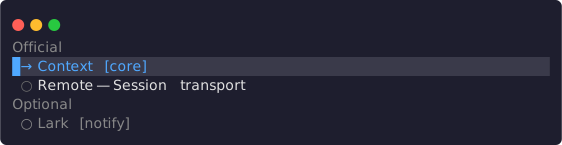
multiple 模式:两组分组标题、badge、detail 与一个 disabled 项(宽度 64)。
ui.list({
  id: 'plugin-list',
  mode: 'multiple',
  selectedIds: ['context'],
  items: [
    { id: 'context', label: 'Context', group: 'Official', badge: 'core' },
    { id: 'remote', label: 'Remote', group: 'Official', detail: 'Session transport' },
    { id: 'lark', label: 'Lark', group: 'Optional', badge: 'notify', disabled: true },
  ],
})
事件载荷:
- single:
{ kind: 'selection-change', controlId: id, value: item.id } - multiple:
value是切换该 item 后建议的完整string[]
form
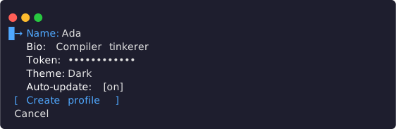
五种 field 的默认状态:secret 值被遮蔽,select 显示当前值,toggle 显示开关(宽度 64)。
ui.form({
  id: string
  fields: readonly BlueFormField[]
  submitActionId?: string
  cancelActionId?: string
})
Form field 是以下判别联合:
kind | 必填字段 | 可选字段 | value-change value |
|---|---|---|---|
input | id、label、value: string | placeholder、error、disabled | string |
textarea | 同 input | 同 input | string |
secret | 同 input | 同 input;renderer 遮蔽 value | string |
select | id、label、value: string | null、options: BlueListItem[] | error、disabled | string | null |
toggle | id、label、value: boolean | error、disabled | boolean |
上面的截图渲染的就是这个节点:
ui.form({
  id: 'profile-form',
  fields: [
    { kind: 'input', id: 'name', label: 'Name', value: 'Ada' },
    { kind: 'textarea', id: 'bio', label: 'Bio', value: 'Compiler tinkerer' },
    { kind: 'secret', id: 'token', label: 'Token', value: 'sk-live-9f27' },
    { kind: 'select', id: 'theme', label: 'Theme', value: 'dark', options: [
      { id: 'dark', label: 'Dark' },
      { id: 'light', label: 'Light' },
    ] },
    { kind: 'toggle', id: 'updates', label: 'Auto-update', value: true },
  ],
  submitActionId: 'Create profile',
  cancelActionId: 'Cancel',
})
文本输入过程中,Blue 保留当前 surface generation 内的编辑 draft,并持续发出 value-change;插件仍应把接受的值写回自己的 view state。重新创建 surface 或 外部 canonical value 改变时,以插件提供的值为准。文本字段第一次 Enter 进入 编辑态,再次 Enter 确认并回到同一字段;textarea 用 Alt+Enter 插入换行。
下面的 form 在 Name 字段按下 Enter 进入编辑态并键入 Ada Lovelace——截图中 的草稿文本和光标就是这个交互序列留下的状态:

编辑态:draft 实时显示,光标位于文本末尾(宽度 64)。
ui.form({
  id: 'profile-form',
  fields: [
    { kind: 'input', id: 'name', label: 'Name', value: '' },
    { kind: 'toggle', id: 'updates', label: 'Auto-update', value: true },
  ],
  submitActionId: 'Create profile',
})
Select 第一次 Enter 进入以 ‹ value › 标识的调整态,Left/Right 只修改 renderer-local 候选;再次 Enter 才发出一次 value-change。Escape 或 Tab 取消并恢复进入调整态时的值;Up/Down 仅在调整态之外切换 form field。
下面的 form 在 Theme 字段按下 Enter 进入调整态,再按一次 Right 把候选切到 Light——‹ Light › 就是调整态的呈现:

调整态:‹ Light › 只是 renderer-local 候选,Enter 确认后才发出 value-change(宽度 64)。
ui.form({
  id: 'profile-form',
  fields: [
    { kind: 'input', id: 'name', label: 'Name', value: 'Ada' },
    { kind: 'select', id: 'theme', label: 'Theme', value: 'dark', options: [
      { id: 'dark', label: 'Dark' },
      { id: 'light', label: 'Light' },
    ] },
  ],
  submitActionId: 'Create profile',
})
error 在字段下方显示校验信息;disabled 字段不进入焦点导航,但仍保留在 提交 values 中:
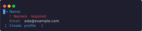
Name 带 error 校验提示;Email 为 disabled,跳过焦点导航(宽度 64)。
ui.form({
  id: 'profile-form',
  fields: [
    { kind: 'input', id: 'name', label: 'Name', value: '', error: 'Name is required' },
    { kind: 'input', id: 'email', label: 'Email', value: 'ada@example.com', disabled: true },
  ],
  submitActionId: 'Create profile',
})
submitActionId 增加提交 control;当前 TUI 把该字符串作为按钮文案,激活后发出:
{
  kind: 'submit',
  controlId: form.id,
  values: { [field.id]: currentDraftValue },
}
cancelActionId 增加取消 control,并发出 { kind: 'activate', controlId: cancelActionId }。
actions

primary、secondary 与带 confirm 的 danger 三种 intent(宽度 64)。
ui.actions({
  id: string
  items: readonly {
    id: string
    label: string
    intent?: 'primary' | 'secondary' | 'danger'
    disabled?: boolean
    busy?: boolean
    confirm?: string
  }[]
})
激活可用 item 时发出 { kind: 'activate', controlId: item.id }。disabled 和 busy item 不可激活;busy 同时表达进行中呈现。带 confirm 的 action 需要在 当前 focus generation 内再次确认,Escape 会先取消待确认状态。intent 只表达 语义优先级,具体样式由主题决定。外层 actions.id 标识这组 action;事件的 controlId 使用被激活 item 的 id。两张截图渲染的都是这个节点:
ui.actions({
  id: 'session-actions',
  items: [
    { id: 'save', label: 'Save', intent: 'primary' },
    { id: 'archive', label: 'Archive', intent: 'secondary' },
    { id: 'discard', label: 'Discard', intent: 'danger', confirm: 'Discard all changes?' },
  ],
})
在 danger 项上按第一次 Enter 后进入待确认状态,confirm 文案就地追加在 label 之后(label ? confirm);再按一次 Enter 才发出 activate:

待确认:confirm 文案 Discard all changes? 就地显示,Escape 取消(宽度 64)。
busy 表示进行中,disabled 表示不可用,两者都不可激活:

busy 项以省略号呈现进行中状态,disabled 项保留但不可激活(宽度 64)。
ui.actions({
  id: 'session-actions',
  items: [
    { id: 'deploy', label: 'Deploy', intent: 'primary', busy: true },
    { id: 'retry', label: 'Retry', disabled: true },
    { id: 'cancel', label: 'Cancel' },
  ],
})
焦点与上下文提示
TUI 会直接从 canonical control 角色推导操作,插件不应在 surface footer 里重复写通用按键教学:
- 焦点按外层 tabs → 内层 tabs → 内容语义组 → 编辑态逐层下钻。
- tab 条用不循环的
←/→移动,Enter下钻;Tab/Shift-Tab在 tab 条上无动作,只在内容层循环语义组并记住组内焦点。 - 内容方向移动不循环;disabled item 不可聚焦。single list 用
Enter激活,multiple list 用Space切换、Enter确认,action 用Enter或Space。 - text/select 进入编辑或调整态后,合法值用
Enter或Tab确认,非法值 保持原字段;Escape 按编辑态 → 内容 → 内层 tabs → 外层 tabs → 关闭逐层返回。 - 待确认 action 的提示切换为
Enter confirm · Esc cancel;只读 scroll 可聚焦, 支持方向键、Page、Home 与 End。
该行只在当前 plugin pane 获得焦点或 capturing overlay 打开时显示。 可关闭 surface 才会提示 Escape;被动 pane 和 non-capturing overlay 不会显示伪操作。 最多显示三个语义片段,窄屏先缩成完整按键 token,再整段隐藏,不会截断半条指令。 局部计数、进度、风险和业务状态仍可放在 footer。
反馈与辅助节点
loader

默认 braille variant,带 elapsed 提示与 cancel control(宽度 64)。
ui.loader({
  message: string
  variant?: 'braille' | 'tide'
  elapsedMs?: number
  cancelActionId?: string
})
variant 默认 braille。elapsedMs 是非负毫秒提示;动画计时仍由 owner 的 生命周期管理,不应由 render() 启动 timer。提供 cancelActionId 时增加一个 control,并发出 activate 事件。上面的截图渲染的就是这个节点:
ui.loader({
  message: 'Waiting for model',
  elapsedMs: 1200,
  cancelActionId: 'Stop',
})
tide variant 用波浪字符代替 braille 点阵:

tide variant(宽度 64)。
ui.loader({
  message: 'Syncing marketplace',
  variant: 'tide',
  elapsedMs: 4200,
})
empty

带 actions slot 的无数据状态(宽度 64)。
ui.empty({
  title: string
  description?: string
  actions?: BlueActionsNode
})用于空结果或无数据状态。actions 必须是 ui.actions() 的结果。上面的截图 渲染的就是这个节点:
ui.empty({
  title: 'No sessions yet',
  description: 'Start one to see it here.',
  actions: ui.actions({
    id: 'empty-actions',
    items: [{ id: 'new', label: 'New session', intent: 'primary' }],
  }),
})
progress

带 label 与计数的 determinate 进度条(宽度 64)。
ui.progress({ label?: string, value: number, max: number })value 必须是非负整数,max 必须是至少 1 的整数;超过 max 的 value 在 admission 时收窄为 max。窄宽度下 renderer 可先隐藏 label 或计数,只保留进度语义。上面的 截图渲染的就是这个节点:
ui.progress({ label: 'Tokens', value: 12_000, max: 28_000 })spacer
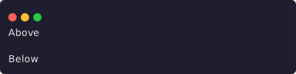
两个文本锚点之间的一行语义留白(宽度 48)。
ui.spacer(options?: { size?: 1 | 2 })插入语义留白,默认 size 为 1。不要用包含空格的 text 模拟布局。ui.spacer() 自身只产生空行,所以截图用两个 text 锚点把它夹在中间——渲染的就是这个节点:
ui.stack.column([
  ui.text('Above'),
  ui.spacer(),
  ui.text('Below'),
])
divider

不带 label 的分隔线(宽度 48)。
ui.divider(options?: { label?: string })插入带可选 label 的语义分隔线;renderer 负责使用分配宽度绘制。上面的截图 渲染的就是这个节点:
ui.divider()事件与重渲染
Pane 和 overlay 把 handler 放在 contribution/request 上,而不是放进节点:
onEvent: (
  event: BlueUiEvent,
  context: BlueUiEventContext,
) => BlueResult | Promise<BlueResult>| 事件 | 来源 | 载荷 |
|---|---|---|
activate | action、cancel、loader cancel | controlId |
selection-change | list | controlId、value |
value-change | form field | controlId、value |
submit | form submit | form controlId、完整 values |
tab-change | tabs | controlId、tabId |
dismiss | 可关闭 surface,例如 overlay Escape | 无 control id |
context 包含当前 surfaceId、revision、AbortSignal 和可选的一次性 userGesture。value-change、selection-change、tab-change 按 control id latest-wins;activate、submit、dismiss 按 surface FIFO。handler 成功后 Blue 自动重渲染;失败、abort、timeout、旧 generation 或卸载后的结果不会提交。
外部 projection、service subscription 或 timer 改变 state 时,再调用 pane/overlay handle 的 refresh()。不要在 onEvent() 成功路径里手动 refresh;这会把当前事件 误判为一次外部替换,并可能 abort 它自己的 generation。
Surface 兼容矩阵
| Surface | 可用节点 | 交互规则 |
|---|---|---|
panes | 完整 BlueUiNode | controls 可用,事件交给 pane onEvent |
| capturing overlay | 完整 BlueUiNode | 打开时必须消费有效 userGesture |
| non-capturing overlay | 只使用 passive 内容/layout | tabs/list/form/actions 等 controls 会使整棵渲染树降级为错误提示 |
additive status | text、rich-text、fields、progress、递归 stack | 始终非交互,不接受 surface/scroll/control |
notification view | BlueView:text、fields、code、diff、sections | 无 controls、无 rich-text/layout |
| editor extension(Experimental) | passive BlueView/rich-text/progress/spacer/divider + stack/surface | 交互 action 走 extension 的独立 actions 字段 |
status.provider、editor.extensions 与 editor.provider 仍是 Experimental/reference surface,不得写进 canonical v1 manifest。新插件优先使用上表前五行的 Public Beta 能力。
验证清单
- 在 120、80、40 列验证所有内容与 responsive branch;不要依赖某个固定坐标。
- 覆盖 disabled、busy、empty、error、loading、abort 和 capability absent fallback。
- 覆盖 consumer unload、owner reload、late event result 与 overlay dismiss。
- 运行 package validator、packed fixture 和 width scan;具体命令见 调试与验证。