UI node reference
This page documents the complete Public Beta wire-node construction API in @dsh-blue/blue-ui. A ui.* builder only constructs, copies, and freezes renderer-neutral data. The Blue renderer owns validation, layout, themes, width, focus, input routing, and event dispatch. The plugin still owns domain data, controlled state, and the meaning of a successful event.
For how node trees are organized and controlled state flows, see the companion Component model guide.
import type { BlueUiEvent, BlueUiEventContext } from '@dsh-blue/blue-api'
import { ui } from '@dsh-blue/blue-ui'
Responsibility boundary
| Blue owns | The plugin owns |
|---|---|
| Rendering text, tabs, lists, forms, actions, and the other nodes | Node data and product copy |
| Theme mapping, width degradation, focus, and navigation in the active renderer | Controlled state such as activeId, selectedIds, and field values |
Converting user input into BlueUiEvent | Validating events and calling the owning domain service/action |
| Rerender after a successful event plus abort, stale, and unload fencing | Calling the pane/overlay handle's refresh() after external data changes |
Nodes never accept renderer callbacks, raw keys, terminal coordinates, ANSI, or focus handles. Do not perform I/O in render(), and do not place Agent, Session, or mutable renderer objects in a node.
Shared rules and limits
- A tree may contain at most 256 nodes, with the root at depth 0 and maximum depth 8. Any array may contain at most 200 entries. Strings across the tree may total at most 20,000 UTF-16 code units.
- Builders recursively copy and freeze inputs and reject cycles. Host admission accepts only plain objects and dense arrays and strips ANSI, C1, and unsafe control characters.
- Numeric layout fields are non-negative safe integers.
minSizecannot exceedmaxSize, and viewport minimums cannot exceed their matching maximums. - Tabs/list/form control ids, form field ids, action item ids, and form/loader submit or cancel ids must not collide in one interactive tree. Tab and list item ids must at least be unique within their node; ids used as controls cannot be empty.
toneis semantic, not a color value:default | muted | accent | success | warning | danger.emphasisisnormal | strong; omission means normal text.
The defaults below describe the current Blue TUI in 0.1.2-alpha.1. The wire contract promises field semantics, not exact border glyphs, color values, or key bindings.
Content nodes
text

A single-line hint in the danger tone (width 48).
ui.text(content: string, options?: { tone?: BlueTone })A semantic text block that the renderer may wrap — use it for status hints, result summaries, and other explanatory copy. An omitted tone uses the theme's normal text color. The screenshot above renders exactly this node:
ui.text('Connection lost', { tone: 'danger' })All six tones side by side:
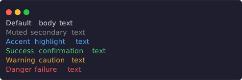
default, muted, accent, success, warning, and danger (width 56).
ui.stack.column([
  ui.text('Default body text'),
  ui.text('Muted secondary text', { tone: 'muted' }),
  ui.text('Accent highlight text', { tone: 'accent' }),
  ui.text('Success confirmation text', { tone: 'success' }),
  ui.text('Warning caution text', { tone: 'warning' }),
  ui.text('Danger failure text', { tone: 'danger' }),
])
Long text wraps at the allocated width instead of clipping:
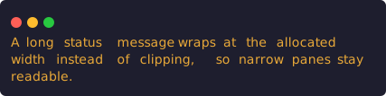
The same warning text occupies three rows at width 48.
ui.text('A long status message wraps at the allocated width instead of clipping, so narrow panes stay readable.', { tone: 'warning' })richText

A muted prefix followed by a strong accent model name (width 64).
ui.richText(spans: readonly BlueInlineSpan[])

type BlueInlineSpan = {
  text: string
  tone?: BlueTone
  emphasis?: 'normal' | 'strong'
}
Combines tone and emphasis within one text block — ideal for "label + highlighted value" inline mixes. The renderer wraps the text; the plugin must not assemble ANSI. The screenshot above renders exactly this node:
ui.richText([
  { text: 'Model ', tone: 'muted' },
  { text: 'deepseek-chat', tone: 'accent', emphasis: 'strong' },
])
Tone and emphasis compose into longer mixed passages:

Muted narration, a strong accent path, a strong number, and a danger tail (width 56).
ui.richText([
  { text: 'Rebuild of ', tone: 'muted' },
  { text: 'packages/core', tone: 'accent', emphasis: 'strong' },
  { text: ' failed after ', tone: 'muted' },
  { text: '42s', emphasis: 'strong' },
  { text: ' with 2 errors', tone: 'danger' },
])
fields

Two label/value rows, the status value in the success tone (width 64).
ui.fields(rows: readonly {
  label: string
  value: readonly BlueInlineSpan[]
}[])
Represents compact label/value information such as session metadata or an environment summary. value is always an array of spans, not an arbitrary BlueUiNode. The screenshot above renders exactly this node:
ui.fields([
  { label: 'Status', value: [{ text: 'Ready', tone: 'success' }] },
  { label: 'Model', value: [{ text: 'deepseek-chat' }] },
])
Across multiple rows, each value can compose several spans for emphasis:
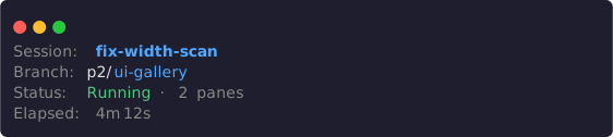
Four rows: a strong accent session name, a two-tone branch, a composed status, and a muted duration (width 64).
ui.fields([
  { label: 'Session', value: [{ text: 'fix-width-scan', tone: 'accent', emphasis: 'strong' }] },
  { label: 'Branch', value: [{ text: 'p2/' }, { text: 'ui-gallery', tone: 'accent' }] },
  { label: 'Status', value: [{ text: 'Running', tone: 'success' }, { text: ' · 2 panes', tone: 'muted' }] },
  { label: 'Elapsed', value: [{ text: '4m 12s', tone: 'muted' }] },
])
code
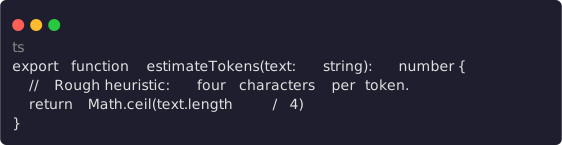
A multi-line code block with the ts language hint (width 64).
ui.code(value: string, options?: { language?: string })Represents code or preformatted text such as patch fragments, command output, or configuration content. language is a renderer hint and does not guarantee syntax highlighting. The screenshot above renders exactly this node:
ui.code([
  'export function estimateTokens(text: string): number {',
  '  // Rough heuristic: four characters per token.',
  '  return Math.ceil(text.length / 4)',
  '}',
].join('\n'), { language: 'ts' })
diff
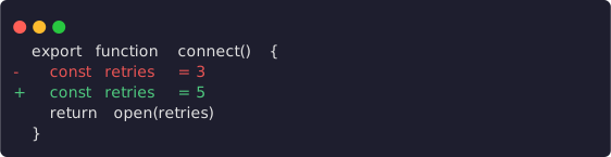
Multi-line before/after: context lines pass through, changed lines are marked -/+ (width 64).
ui.diff(before: string, after: string)Represents the semantic before/after states of the same content, such as a pending edit. Supply plain text rather than manually adding diff colors. The screenshot above renders exactly this node:
ui.diff(
  ['export function connect() {', '  const retries = 3', '  return open(retries)', '}'].join('\n'),
  ['export function connect() {', '  const retries = 5', '  return open(retries)', '}'].join('\n'),
)
sections

One expanded section and one collapsed section side by side (width 64).
ui.sections(sections: readonly {
  title?: string
  body: BlueView
  collapsed?: boolean
}[])
Each body is restricted to the lightweight BlueView union: text | fields | code | diff | sections. It cannot directly contain tabs, forms, actions, or another full BlueUiNode. Omitting collapsed is equivalent to false. With true, the current TUI shows only the section title, or an ellipsis when no title exists. This is static presentation state and does not produce an expand/collapse event. The screenshot above renders exactly this node:
ui.sections([
  {
    title: 'Environment',
    body: ui.fields([
      { label: 'Node', value: [{ text: 'v24.15.0' }] },
    ]),
  },
  {
    title: 'Raw transcript',
    body: ui.text('Hidden until expanded.'),
    collapsed: true,
  },
])
Layout nodes
child

Width 64 satisfies minWidth: 48, so the detail renders.
ui.child(node: BlueUiNode, options?: {
  basis?: number | 'auto'
  grow?: number
  shrink?: number
  minSize?: number
  maxSize?: number
  when?: {
    minWidth?: number
    maxWidth?: number
    minHeight?: number
    maxHeight?: number
  }
})
Plain nodes can enter a stack directly. Wrap a node in ui.child() only when it needs sizing hints or a responsive condition. Sizes are hints along the current stack direction, not fixed terminal row or column promises. when uses the actual viewport allocated to the current surface. When a condition stops matching, the node and its controls leave the tree and Blue reconciles focus. A child is only valid as a stack member; both screenshots render exactly this node:
ui.stack.column([
  ui.text('Session overview'),
  ui.child(ui.text('Wide-only detail'), { grow: 1, when: { minWidth: 48 } }),
])
The same node at width 40: the condition no longer holds, the detail leaves the tree, and only the heading row remains:

Width 40 fails minWidth: 48; Wide-only detail leaves the tree.
stack.row / stack.column

A row with a gap nested inside a column (width 64).
ui.stack.row(children, options?)
ui.stack.column(children, options?)

type StackOptions = {
  gap?: 0 | 1 | 2
  align?: 'stretch' | 'start' | 'center' | 'end'
}
row expresses horizontal placement and column expresses vertical placement. The current TUI uses gap 0 and stretch alignment when omitted. A renderer may safely degrade spatial layout on a surface without spatial layout, so do not depend on absolute child coordinates. The screenshot above renders exactly this node:
ui.stack.column([
  ui.stack.row([ui.text('left'), ui.text('right')], { gap: 1 }),
  ui.text('below'),
])
Combined with ui.child()'s grow, a row splits its width proportionally:

grow: 1 and grow: 2 split the row width 1:2 (width 64).
ui.stack.row([
  ui.child(ui.surface({ chrome: 'lane', child: ui.text('grow 1') }), { grow: 1 }),
  ui.child(ui.surface({ chrome: 'lane', child: ui.text('grow 2') }), { grow: 2 }),
], { gap: 1 })
surface
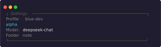
Title, subtitle, badges, surface border chrome, padding, and a footer in one container (width 64).
ui.surface({
  title?: string
  subtitle?: string
  badges?: readonly BlueInlineSpan[]
  chrome?: 'none' | 'lane' | 'surface' | 'overlay'
  padding?: 0 | 1 | 2
  child: BlueUiNode
  footer?: BlueUiNode
})
surface combines heading metadata, body content, and an optional footer.
| Field | Meaning |
|---|---|
title | Primary heading |
subtitle | Muted supporting line after the heading |
badges | Badge line built from semantic spans |
chrome | Border intent; defaults to none |
padding | Content inset level; defaults to 0 |
child | Required body |
footer | Optional node between the body and bottom border |
chrome: 'overlay' is only a visual intent. It does not create an overlay; use api.overlays.open() for the actual surface. The screenshot above renders exactly this node:
ui.surface({
  title: 'Settings',
  subtitle: 'Profile blue-dev',
  badges: [{ text: 'alpha', tone: 'accent' }],
  chrome: 'surface',
  padding: 1,
  child: ui.fields([
    { label: 'Model', value: [{ text: 'deepseek-chat' }] },
  ]),
  footer: ui.text('Footer note', { tone: 'muted' }),
})
chrome: 'lane' is the lighter variant: the title sits inside a top rule with no full border:

Lane chrome: the title embedded in a top rule (width 64).
ui.surface({
  title: 'Context',
  chrome: 'lane',
  child: ui.text('Lane chrome body'),
})
scroll
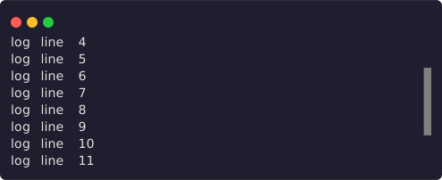
Sixteen lines in an eight-row viewport after scrolling down three rows, with the scrollbar: true thumb visible (width 56).
ui.scroll(node: BlueUiNode, options?: {
  follow?: 'none' | 'start' | 'end'
  scrollbar?: boolean
})
follow expresses the desired position after refresh; omission behaves as none. In an alternate-screen surface, the current TUI actively follows the end for end, while start and none begin at the top without active following. The outer scroll owner takes over on the main screen. scrollbar: true requests a visible scrollbar. The parent layout supplies the actual scroll height. Nested scroll nodes are rejected. The screenshot above renders exactly this node:
ui.scroll(
  ui.stack.column(Array.from({ length: 16 }, (_, index) => ui.text(`log line ${index + 1}`))),
  { scrollbar: true },
)
Controlled interactive nodes
Every interactive node receives canonical state from the plugin and emits a proposed next state. After the plugin accepts the proposal and onEvent() returns success, Blue automatically calls render() again. Nodes do not permanently mutate plugin state on their own.
tabs

Initial state: activeId: 'summary', a count badge on advanced, and a disabled legacy tab (width 64).
ui.tabs({
  id: string
  activeId: string
  items: readonly {
    id: string
    label: string
    disabled?: boolean
    count?: number
  }[]
})activeIdmust name an item; the plugin stores and updates it.- A disabled item remains visible but cannot be activated.
countis a non-negative safe-integer hint that a renderer may hide at narrow widths.- Tabs render only the tab strip, not each tab's body.
- Activating an item emits
{ kind: 'tab-change', controlId: id, tabId: item.id }.
let activeTab = 'summary'

const render = () => ui.stack.column([
  ui.tabs({
    id: 'settings-tabs',
    activeId: activeTab,
    items: [
      { id: 'summary', label: 'Summary' },
      { id: 'advanced', label: 'Advanced', count: 4 },
      { id: 'legacy', label: 'Legacy', disabled: true },
    ],
  }),
  activeTab === 'summary'
    ? ui.text('Summary content')
    : ui.text('Advanced content'),
])

const onEvent = (event: BlueUiEvent) => {
  if (event.kind === 'tab-change' && event.controlId === 'settings-tabs') {
    activeTab = event.tabId
  }
  return { ok: true, value: undefined } as const
}
After the plugin accepts tab-change and writes activeTab = 'advanced', the next render() output looks like this — both the strip highlight and the body follow canonical state:

activeId: 'advanced': the count badge rides the highlighted item and the body switches (width 64).
ui.stack.column([
  ui.tabs({
    id: 'settings-tabs',
    activeId: 'advanced',
    items: [
      { id: 'summary', label: 'Summary' },
      { id: 'advanced', label: 'Advanced', count: 4 },
      { id: 'legacy', label: 'Legacy', disabled: true },
    ],
  }),
  ui.text('Advanced content'),
])
list

Single mode with the first item selected (width 64).
ui.list({
  id: string
  mode?: 'single' | 'multiple'
  selectedIds: readonly string[]
  items: readonly BlueListItem[]
  filter?: string
  empty?: BlueUiNode
})

type BlueListItem = {
  id: string
  label: string
  detail?: string
  detailSpans?: readonly BlueInlineSpan[]
  badge?: string
  group?: string
  disabled?: boolean
}
mode defaults to single. Single mode permits at most one selected id, and every selected id must exist in items. detailSpans takes precedence over detail. group is a grouping heading and badge is a compact label. A renderer may hide detail at narrow widths. The screenshot above renders exactly this node:
ui.list({
  id: 'item-list',
  selectedIds: ['one'],
  items: [
    { id: 'one', label: 'First item' },
    { id: 'two', label: 'Second item' },
  ],
})
filter only displays the current query; it does not filter items for the plugin. Pass the already-filtered items. When items is empty, Blue renders empty; omitting empty produces no rows.
Multiple mode combines with group, badge, detail, and disabled for richer pickers:
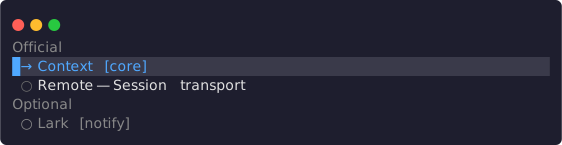
Multiple mode: two group headings, badges, a detail, and one disabled item (width 64).
ui.list({
  id: 'plugin-list',
  mode: 'multiple',
  selectedIds: ['context'],
  items: [
    { id: 'context', label: 'Context', group: 'Official', badge: 'core' },
    { id: 'remote', label: 'Remote', group: 'Official', detail: 'Session transport' },
    { id: 'lark', label: 'Lark', group: 'Optional', badge: 'notify', disabled: true },
  ],
})
Event payloads:
- single:
{ kind: 'selection-change', controlId: id, value: item.id } - multiple:
valueis the proposed completestring[]after toggling the item
form
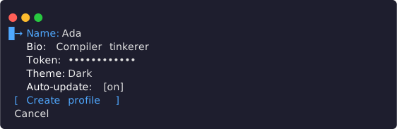
All five field kinds in their default state: the secret value is masked, the select shows its current value, and the toggle shows its switch (width 64).
ui.form({
  id: string
  fields: readonly BlueFormField[]
  submitActionId?: string
  cancelActionId?: string
})
A form field is this discriminated union:
kind | Required fields | Optional fields | value-change value |
|---|---|---|---|
input | id, label, value: string | placeholder, error, disabled | string |
textarea | Same as input | Same as input | string |
secret | Same as input | Same as input; renderer masks value | string |
select | id, label, value: string | null, options: BlueListItem[] | error, disabled | string | null |
toggle | id, label, value: boolean | error, disabled | boolean |
The screenshot above renders exactly this node:
ui.form({
  id: 'profile-form',
  fields: [
    { kind: 'input', id: 'name', label: 'Name', value: 'Ada' },
    { kind: 'textarea', id: 'bio', label: 'Bio', value: 'Compiler tinkerer' },
    { kind: 'secret', id: 'token', label: 'Token', value: 'sk-live-9f27' },
    { kind: 'select', id: 'theme', label: 'Theme', value: 'dark', options: [
      { id: 'dark', label: 'Dark' },
      { id: 'light', label: 'Light' },
    ] },
    { kind: 'toggle', id: 'updates', label: 'Auto-update', value: true },
  ],
  submitActionId: 'Create profile',
  cancelActionId: 'Cancel',
})
While text is edited, Blue keeps a draft within the current surface generation and continuously emits value-change. The plugin must still write accepted values back to its view state. A recreated surface or an externally changed canonical value wins over the old draft. The first Enter enters a text field; the next Enter confirms and returns to that field's navigation state. Alt+Enter inserts a textarea newline.
In the form below, pressing Enter on the Name field enters edit mode and typing Ada Lovelace leaves a draft — the shot shows the draft text and the cursor that this interaction sequence produces:

Edit mode: the draft renders live with the cursor at the end of the text (width 64).
ui.form({
  id: 'profile-form',
  fields: [
    { kind: 'input', id: 'name', label: 'Name', value: '' },
    { kind: 'toggle', id: 'updates', label: 'Auto-update', value: true },
  ],
  submitActionId: 'Create profile',
})
The first Enter on a select opens an adjustment state shown as ‹ value ›. Left/Right changes only the renderer-local candidate; another Enter emits one confirmed value-change. Escape or Tab cancels and restores the value captured on entry. Up/Down changes form fields only outside the adjustment state.
In the form below, pressing Enter on the Theme field opens the adjustment state and one Right step moves the candidate to Light — ‹ Light › is the adjustment presentation:

Adjustment state: ‹ Light › is only a renderer-local candidate until Enter confirms one value-change (width 64).
ui.form({
  id: 'profile-form',
  fields: [
    { kind: 'input', id: 'name', label: 'Name', value: 'Ada' },
    { kind: 'select', id: 'theme', label: 'Theme', value: 'dark', options: [
      { id: 'dark', label: 'Dark' },
      { id: 'light', label: 'Light' },
    ] },
  ],
  submitActionId: 'Create profile',
})
error shows a validation message under the field; disabled fields do not enter focus navigation but remain present in submitted values:
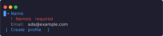
Name carries an error message; Email is disabled and skipped by focus navigation (width 64).
ui.form({
  id: 'profile-form',
  fields: [
    { kind: 'input', id: 'name', label: 'Name', value: '', error: 'Name is required' },
    { kind: 'input', id: 'email', label: 'Email', value: 'ada@example.com', disabled: true },
  ],
  submitActionId: 'Create profile',
})
submitActionId adds a submit control. The current TUI uses the string as the button label, and activation emits:
{
  kind: 'submit',
  controlId: form.id,
  values: { [field.id]: currentDraftValue },
}
cancelActionId adds a cancel control and emits { kind: 'activate', controlId: cancelActionId }.
actions

The three intents: primary, secondary, and a danger item carrying a confirm prompt (width 64).
ui.actions({
  id: string
  items: readonly {
    id: string
    label: string
    intent?: 'primary' | 'secondary' | 'danger'
    disabled?: boolean
    busy?: boolean
    confirm?: string
  }[]
})
Activating an enabled item emits { kind: 'activate', controlId: item.id }. Disabled and busy items cannot activate; busy also communicates in-progress presentation. An action with confirm requires a second confirmation in the current focus generation, and Escape first clears pending confirmation. intent communicates semantic priority; the theme owns its appearance. The outer actions.id identifies the group, while an event's controlId is the activated item's id. Both screenshots render exactly this node:
ui.actions({
  id: 'session-actions',
  items: [
    { id: 'save', label: 'Save', intent: 'primary' },
    { id: 'archive', label: 'Archive', intent: 'secondary' },
    { id: 'discard', label: 'Discard', intent: 'danger', confirm: 'Discard all changes?' },
  ],
})
After the first Enter on the danger item, the pending-confirmation state appends the confirm prompt after the label in place (label ? confirm); only a second Enter emits activate:

Pending confirmation: the prompt Discard all changes? shows in place, Escape cancels (width 64).
busy marks an in-progress action and disabled an unavailable one; neither can activate:

The busy item shows an in-progress ellipsis; the disabled item stays visible but cannot activate (width 64).
ui.actions({
  id: 'session-actions',
  items: [
    { id: 'deploy', label: 'Deploy', intent: 'primary', busy: true },
    { id: 'retry', label: 'Retry', disabled: true },
    { id: 'cancel', label: 'Cancel' },
  ],
})
Focus and contextual hints
The TUI derives operations directly from canonical control roles. Plugins should not repeat generic keyboard teaching in a surface footer:
- Focus descends through outer tabs → nested tabs → content groups → editing.
- A tab strip uses non-wrapping Left/Right and Enter to descend. Tab/Shift-Tab is inert on tab strips and cycles semantic groups only in content, remembering the last focused item in each group.
- Directional content movement does not wrap and disabled items cannot receive focus. Single lists activate with Enter; multiple lists toggle with Space and confirm with Enter; actions accept Enter or Space.
- Valid text/select editing confirms with Enter or Tab, while invalid input stays active. Escape climbs editing → content → nested tabs → outer tabs → close, one layer at a time.
- A pending action confirmation changes the hint to
Enter confirm · Esc cancel. Read-only scroll regions are focusable and support arrows, Page, Home, and End.
The row appears only while a plugin pane owns focus or a capturing overlay is open. Escape is advertised only for a surface that can actually close; passive panes and non-capturing overlays do not show a false operation. At most three semantic fragments are shown. Narrow layouts first use complete compact key tokens, then remove whole fragments rather than clipping half an instruction. Local counts, progress, risk, and business status still belong in the footer.
Feedback and utility nodes
loader

The default braille variant with the elapsed hint and a cancel control (width 64).
ui.loader({
  message: string
  variant?: 'braille' | 'tide'
  elapsedMs?: number
  cancelActionId?: string
})
variant defaults to braille. elapsedMs is a non-negative millisecond hint. The owning lifecycle manages animation timers; never start one in render(). A cancelActionId adds a control that emits activate. The screenshot above renders exactly this node:
ui.loader({
  message: 'Waiting for model',
  elapsedMs: 1200,
  cancelActionId: 'Stop',
})
The tide variant replaces the braille dots with a wave glyph:

The tide variant (width 64).
ui.loader({
  message: 'Syncing marketplace',
  variant: 'tide',
  elapsedMs: 4200,
})
empty

A no-data state with the actions slot filled (width 64).
ui.empty({
  title: string
  description?: string
  actions?: BlueActionsNode
})
Represents an empty result or no-data state. actions must be the result of ui.actions(). The screenshot above renders exactly this node:
ui.empty({
  title: 'No sessions yet',
  description: 'Start one to see it here.',
  actions: ui.actions({
    id: 'empty-actions',
    items: [{ id: 'new', label: 'New session', intent: 'primary' }],
  }),
})
progress

A determinate bar with label and count (width 64).
ui.progress({ label?: string, value: number, max: number })value is a non-negative integer and max is an integer of at least 1. Host admission clamps a value above max to max. At narrow widths a renderer may hide the label or count while preserving the progress meaning. The screenshot above renders exactly this node:
ui.progress({ label: 'Tokens', value: 12_000, max: 28_000 })spacer
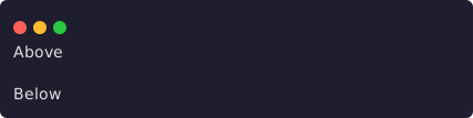
One row of semantic whitespace between two text anchors (width 48).
ui.spacer(options?: { size?: 1 | 2 })Inserts semantic spacing and defaults to size 1. Do not simulate layout with a text node full of spaces. ui.spacer() alone produces only blank rows, so the shot clamps it between two text anchors — it renders exactly this node:
ui.stack.column([
  ui.text('Above'),
  ui.spacer(),
  ui.text('Below'),
])
divider

A divider without a label (width 48).
ui.divider(options?: { label?: string })Inserts a semantic divider with an optional label. The renderer draws it at the assigned width. The screenshot above renders exactly this node:
ui.divider()Events and rerendering
Panes and overlays place the handler on the contribution/request, not on an individual node:
onEvent: (
  event: BlueUiEvent,
  context: BlueUiEventContext,
) => BlueResult | Promise<BlueResult>| Event | Source | Payload |
|---|---|---|
activate | Action, cancel, loader cancel | controlId |
selection-change | List | controlId, value |
value-change | Form field | controlId, value |
submit | Form submit | Form controlId, complete values |
tab-change | Tabs | controlId, tabId |
dismiss | A dismissible surface such as overlay Escape | No control id |
context carries the current surfaceId, revision, AbortSignal, and an optional one-shot userGesture. value-change, selection-change, and tab-change are latest-wins per control id. activate, submit, and dismiss are FIFO per surface. Blue automatically rerenders after handler success. Failure, abort, timeout, an old generation, or a result after unload cannot commit.
Call the pane/overlay handle's refresh() when an external projection, service subscription, or timer changes state. Do not manually refresh in a successful onEvent() path. Doing so is an external replacement and may abort the event's own generation.
Surface compatibility matrix
| Surface | Allowed nodes | Interaction rule |
|---|---|---|
panes | Full BlueUiNode | Controls work and events go to pane onEvent |
| Capturing overlay | Full BlueUiNode | Opening must consume a valid userGesture |
| Non-capturing overlay | Passive content/layout only | Tabs/list/form/actions controls replace the whole render tree with an error message |
Additive status | text, rich-text, fields, progress, recursive stack | Always passive; no surface, scroll, or controls |
Notification view | BlueView: text, fields, code, diff, sections | No controls and no rich-text/layout |
| Editor extension (Experimental) | Passive BlueView/rich-text/progress/spacer/divider plus stack/surface | Interactive actions use the extension's separate actions field |
status.provider, editor.extensions, and editor.provider remain Experimental/reference surfaces and cannot appear in a canonical v1 manifest. New plugins should prefer the Public Beta surfaces in the first five rows.
Validation checklist
- Exercise every content and responsive branch at 120, 80, and 40 columns; never rely on an absolute coordinate.
- Cover disabled, busy, empty, error, loading, abort, and capability-absent fallback states.
- Cover consumer unload, owner reload, late event results, and overlay dismiss.
- Run the package validator, packed fixture, and width scan described in Testing and validation.